

Client
Jigawa State First Lady
Services
- Campaign
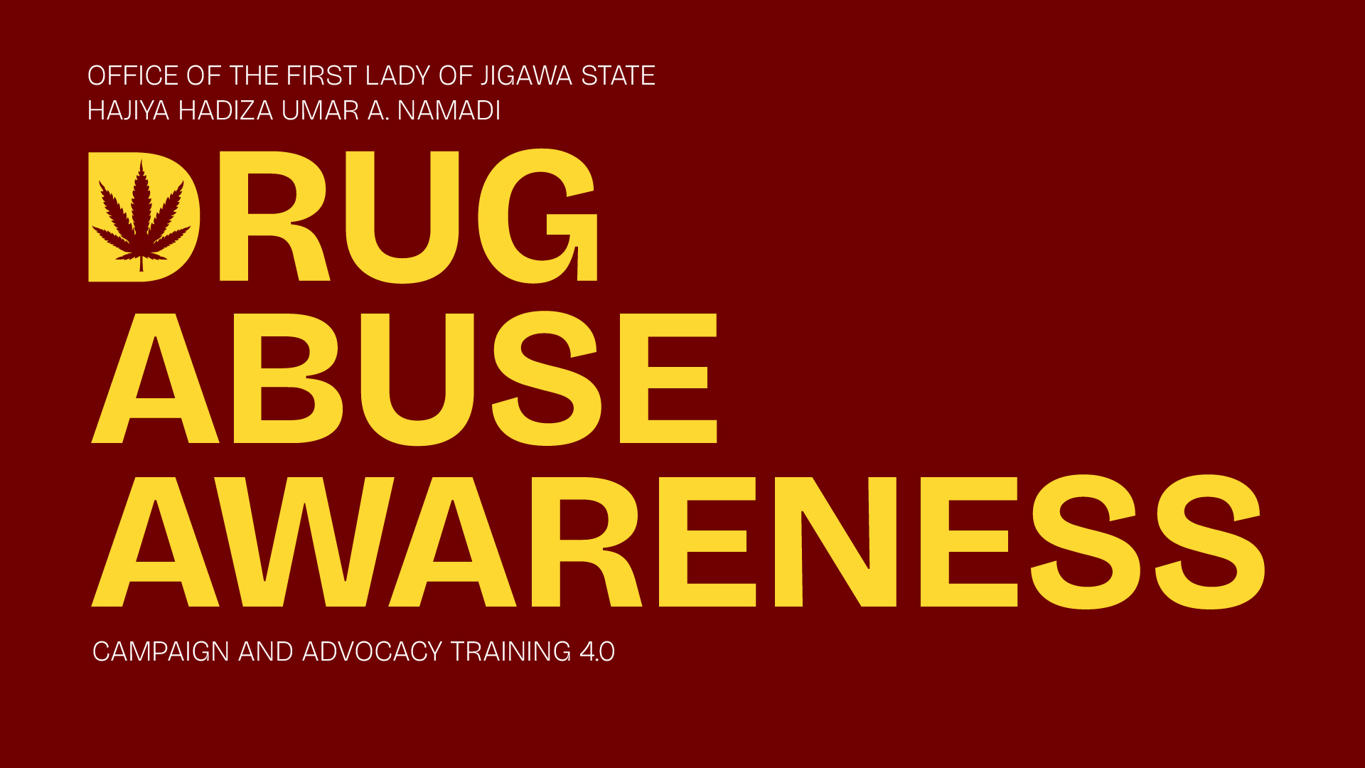
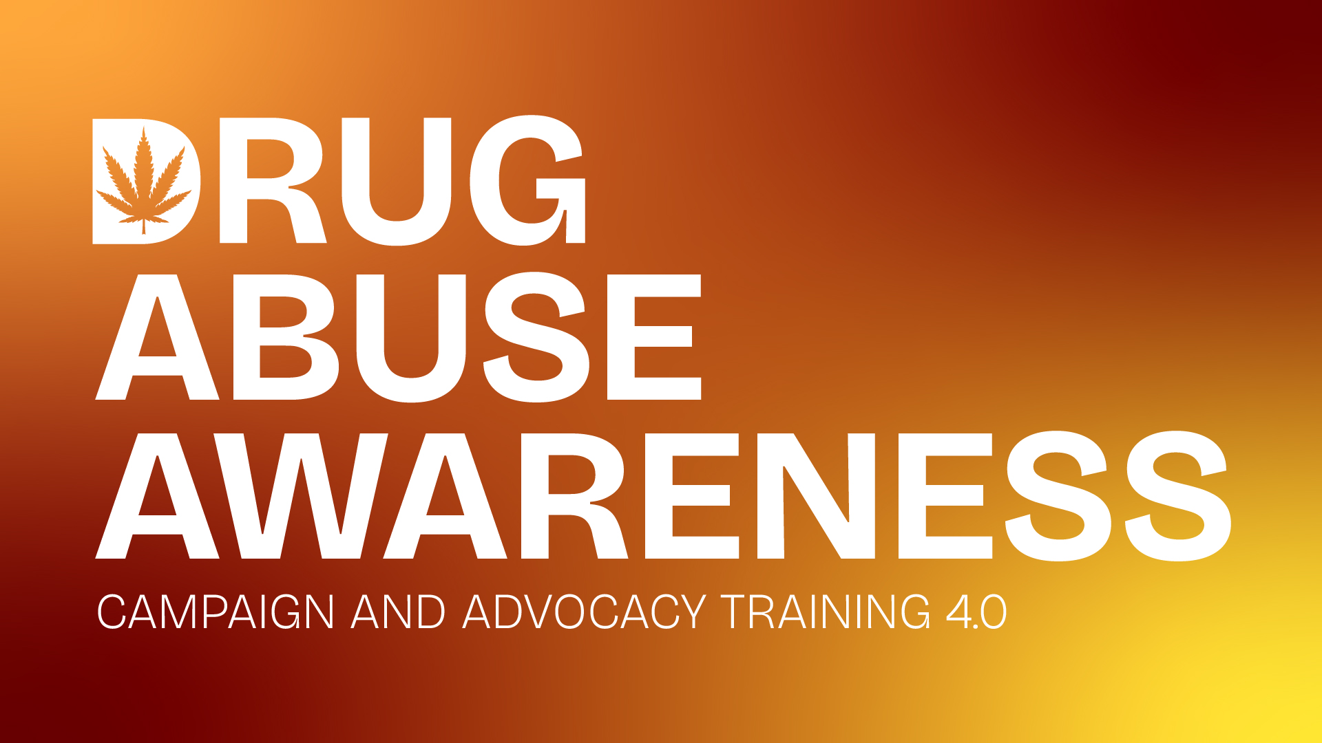
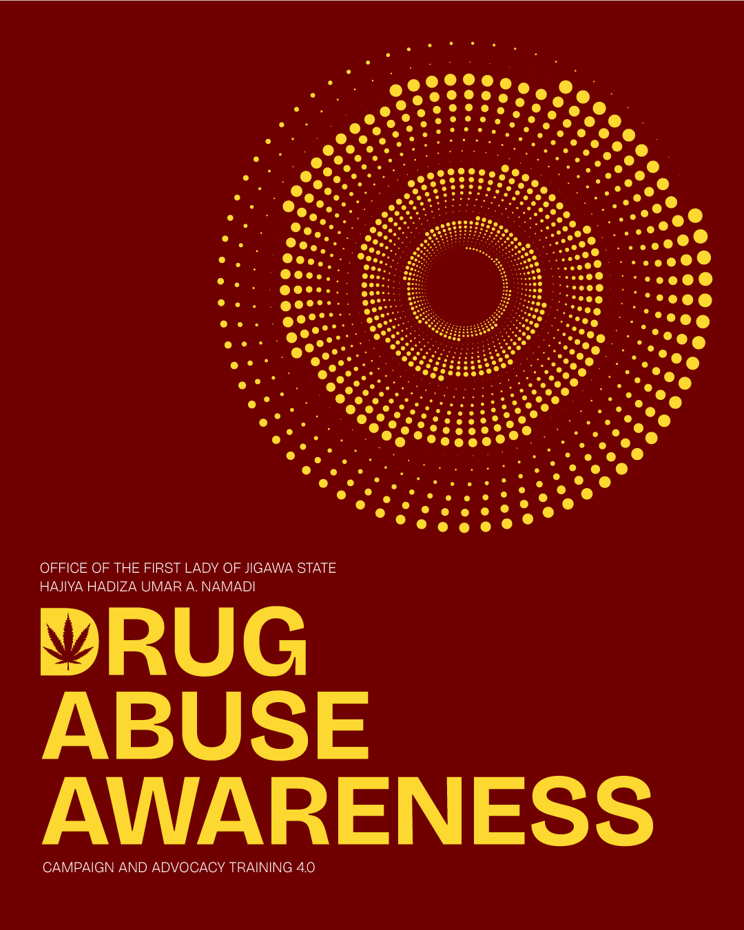
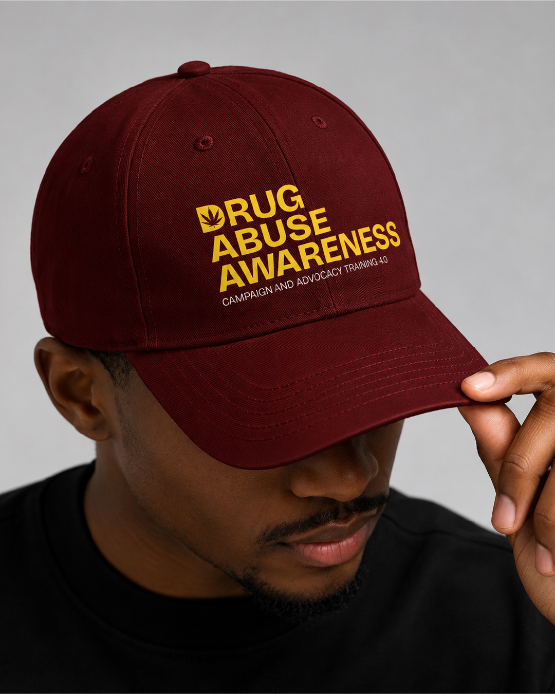
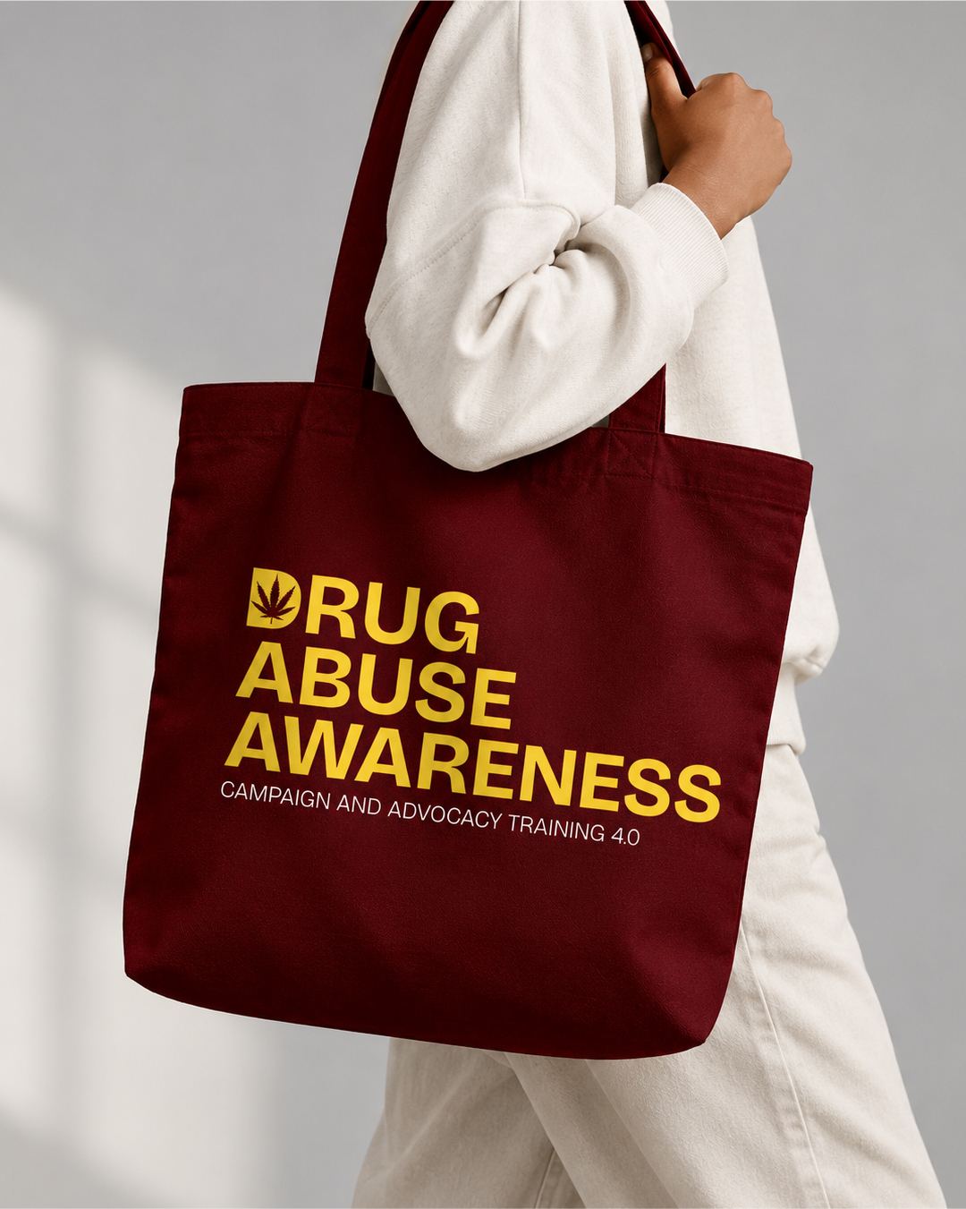
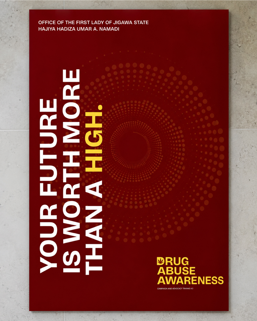
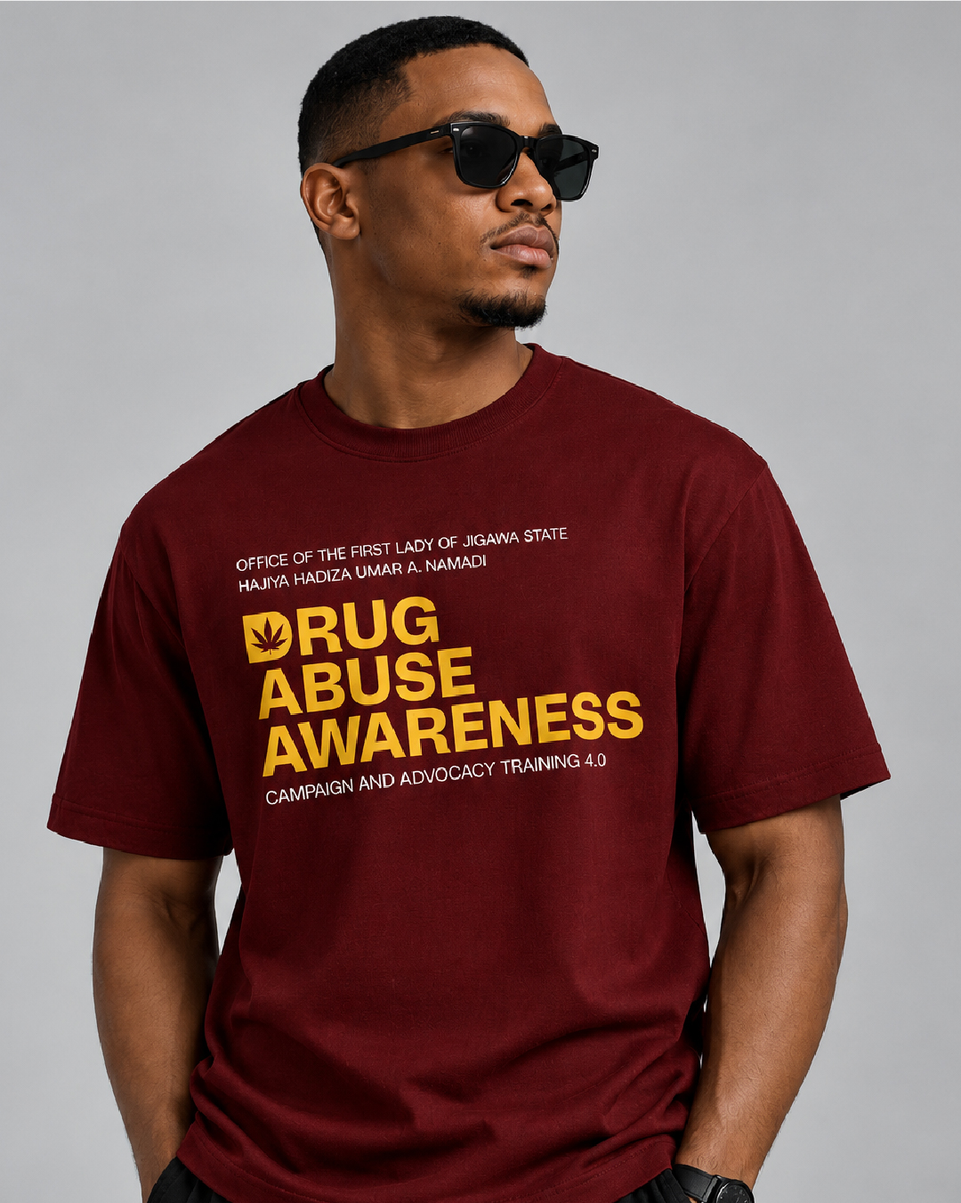
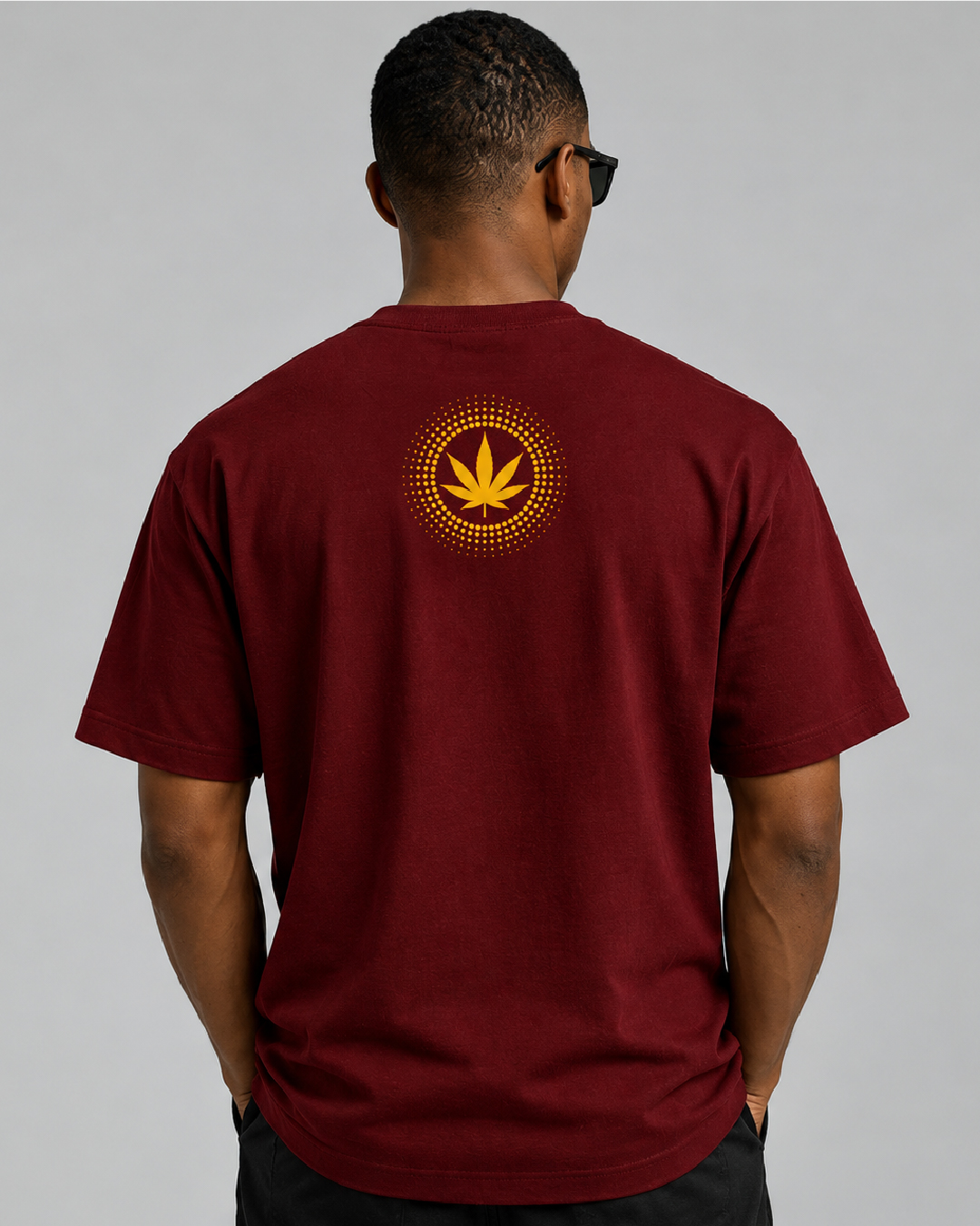
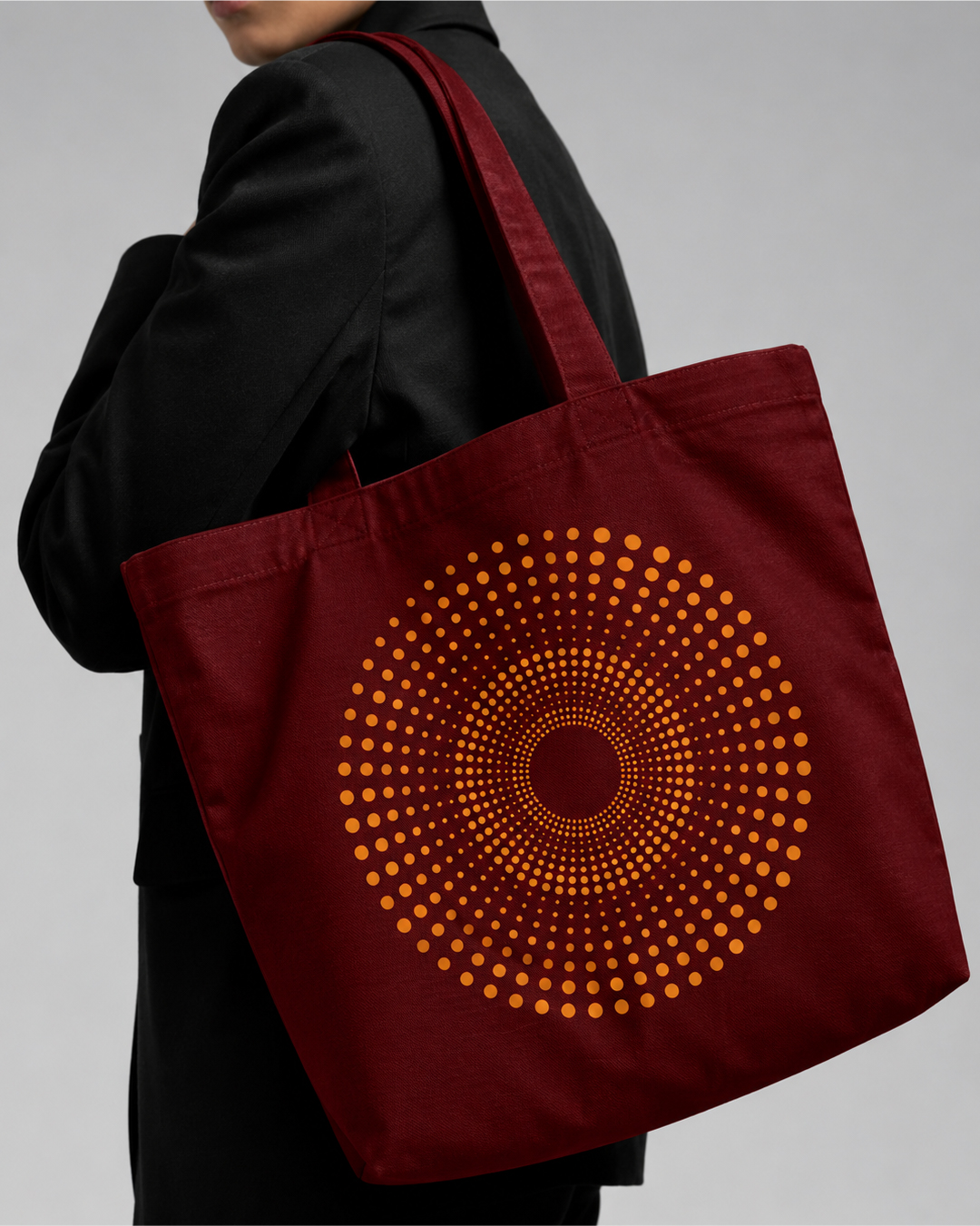
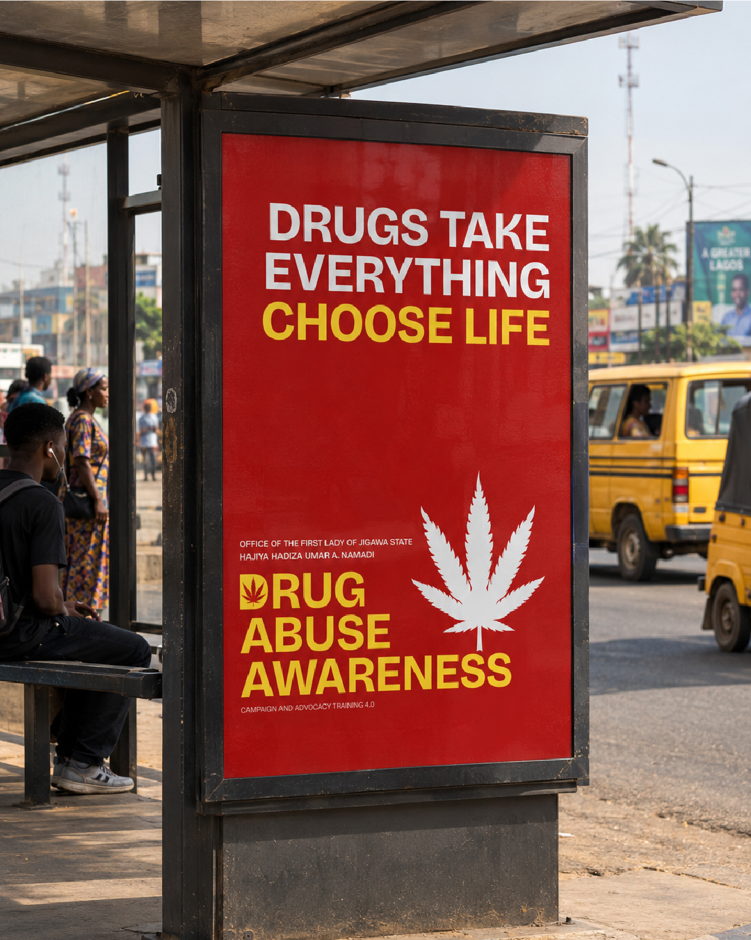
We’re proud to share the brand identity we created for Drug Abuse Awareness: Campaign and Advocacy Training 4.0, an initiative of the Office of the First Lady of Jigawa State. The brief: speak to young people about a serious issue without lecturing them, and make it unmistakable from across a room. Here’s what we did: The D. A bold D for “Drug”, standing for the cause we are fighting. The leaf. A cannabis leaf cut out of the D. Cannabis is the most widely used drug in Nigeria, but the message covers every drug. The cutout. The leaf is empty space, a reminder of what drug abuse takes out of a young life. The colours. Deep maroon for seriousness, warm yellow for hope, and an orange glow for warning. No green, on purpose. From the logo to the posters, the flyer, totes, caps and tees, everything carries one clear voice: Your future is worth more than a high.

Next project
ESAM FOUNDATION BRAND IDENTITY DESIGN
Make the next one
Like this direction?Let's shape yours.
Share what needs to move: the brand, the campaign, the launch, or the system holding everything together.
Read praise from clients