

Client
ESAM FOUNDATION
Services
- Identity Design
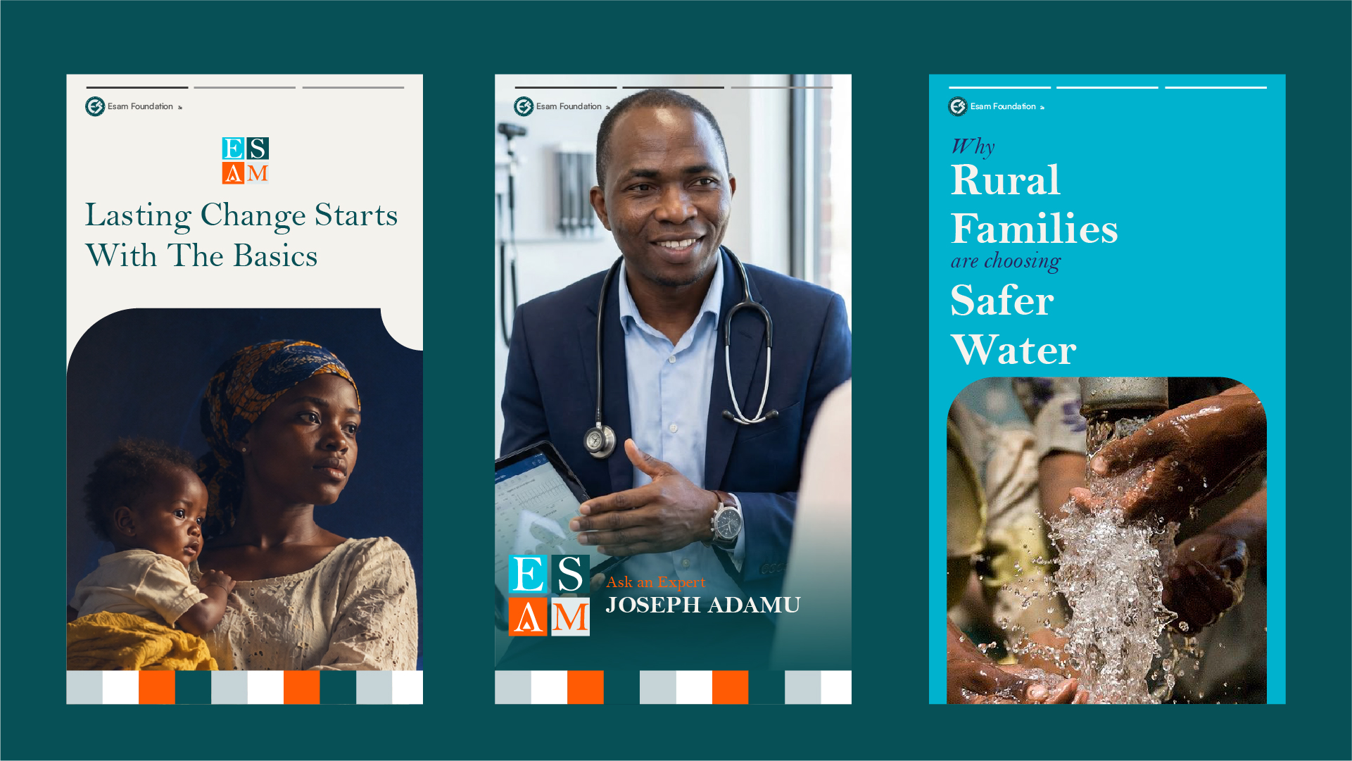
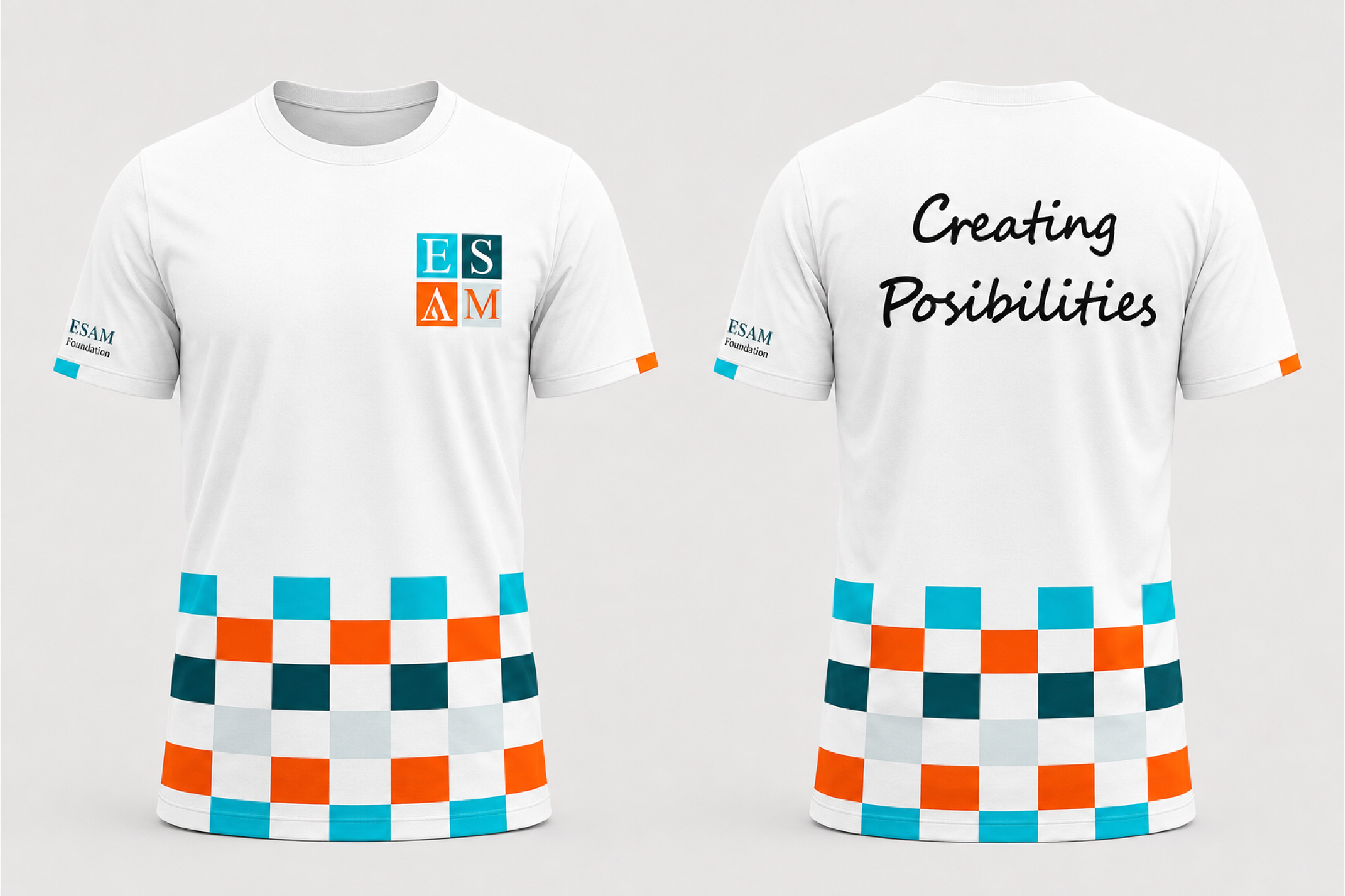
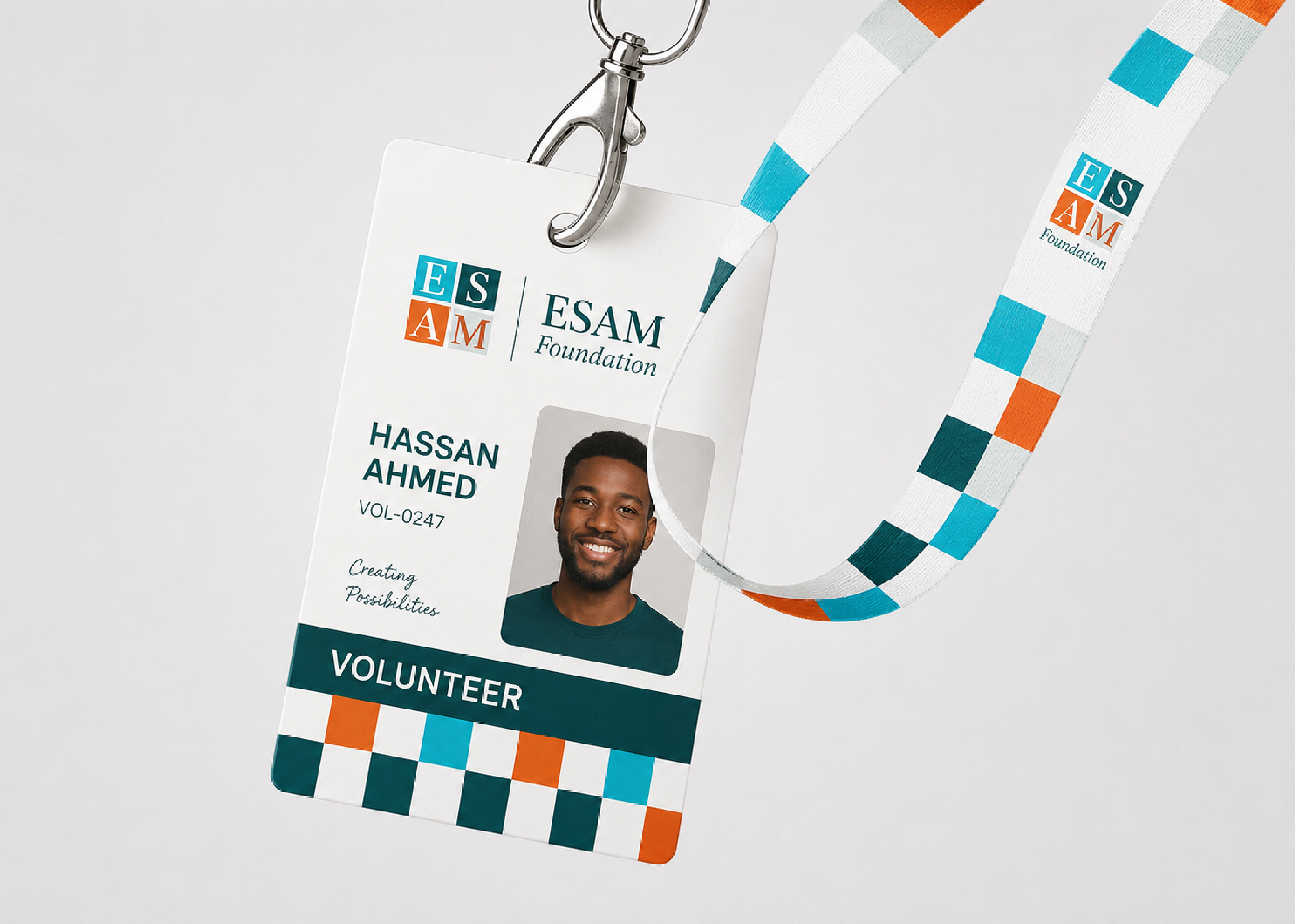
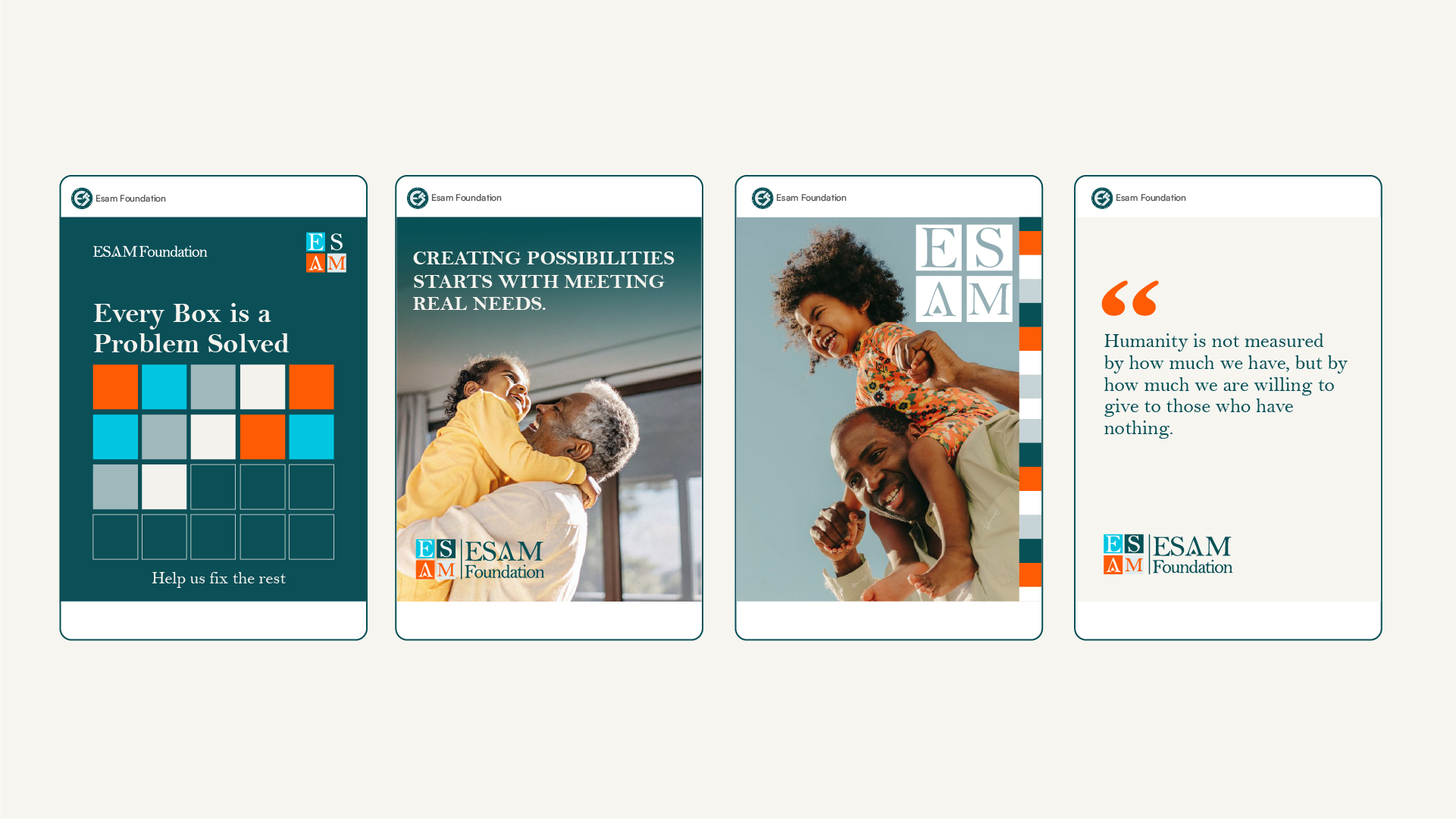
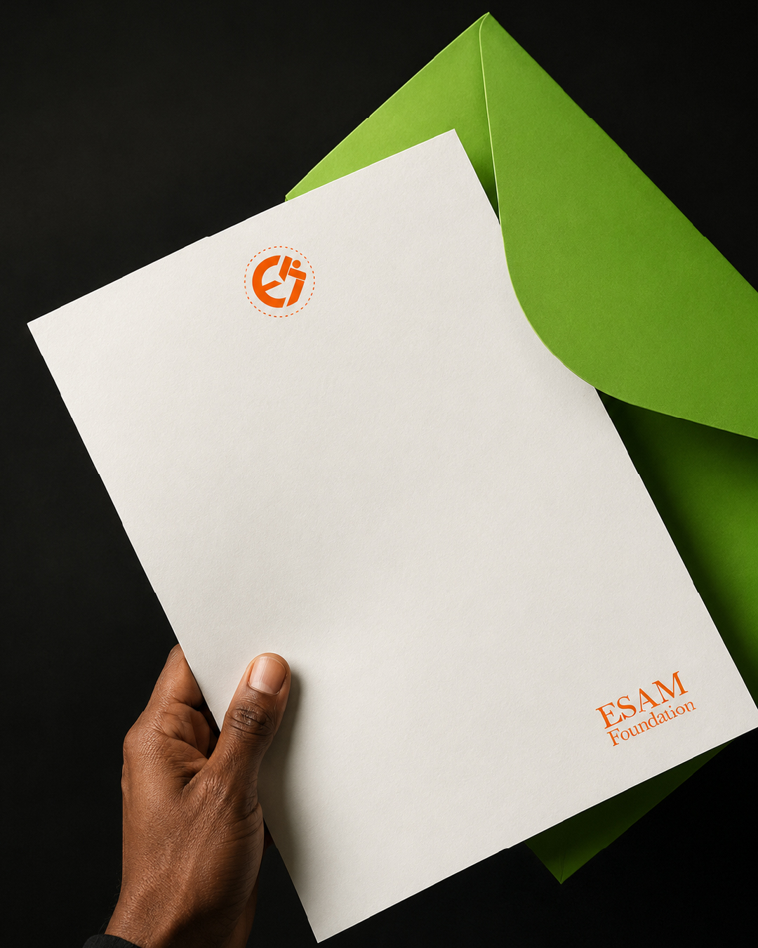
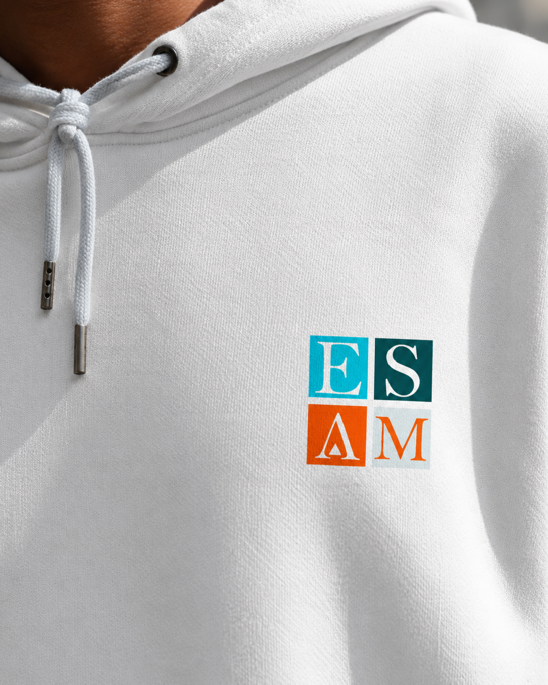
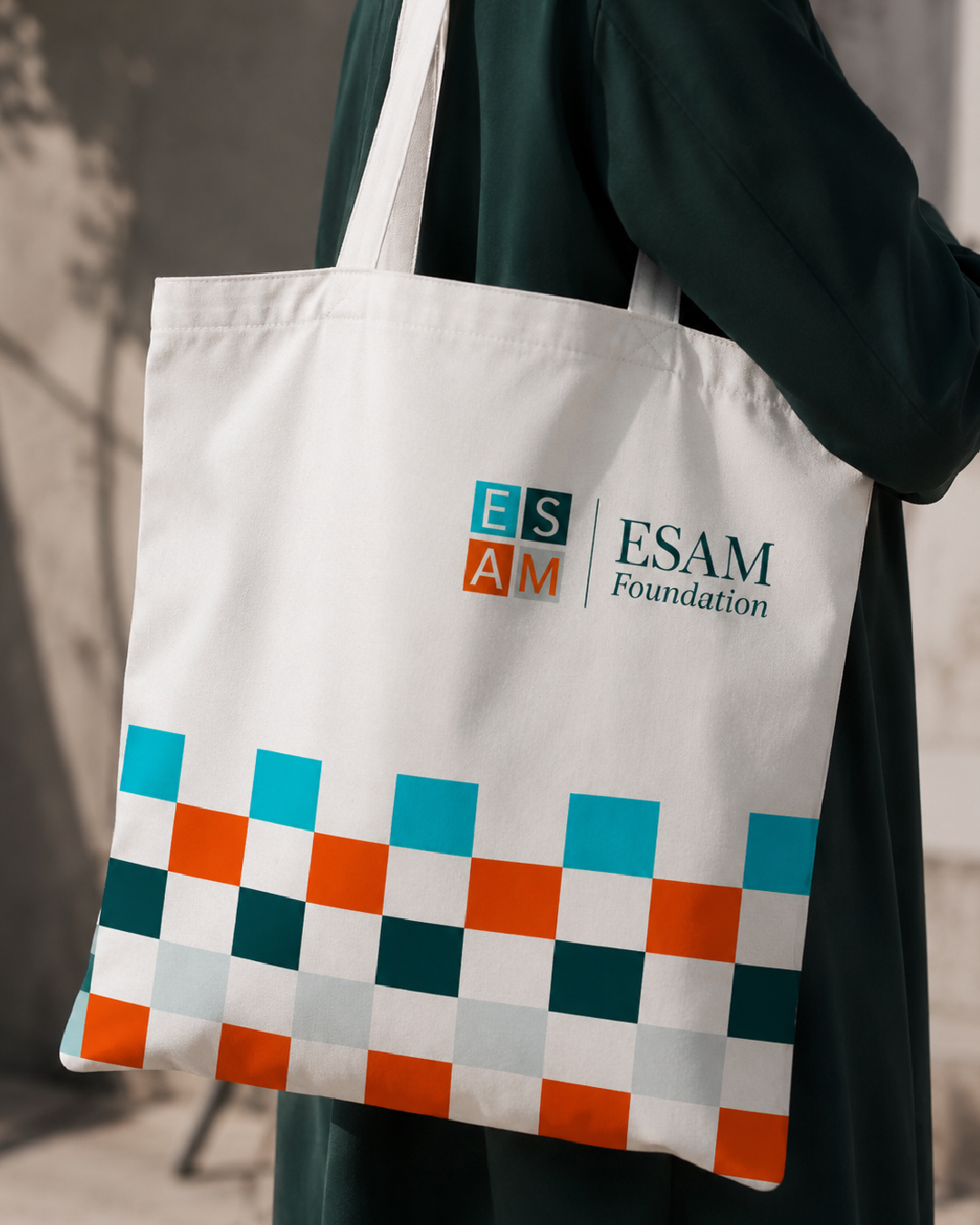
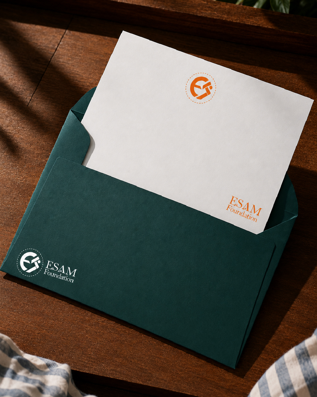
Graphix Pyramid Studio has designed a new brand identity for the ESAM Foundation, a humanitarian organization working to solve problems one community at a time. Humanitarian need is vast, and vastness is hard to fund. The identity begins with a simple idea: change happens one unit at a time. That unit is the box. The ESAM logo sets its four letters in four squares, so the mark is itself a small grid. Repeated and extended, those squares become a modular pattern that runs across every touchpoint. Each box stands for a need met, a person reached or a project completed, and the spaces between them stand for the work still to do. The palette is drawn from the same logic. Deep teal conveys steadiness and trust. Orange signals urgency and action. Cyan and soft grey-blue bring openness and care. Paired with a classic serif wordmark for the Foundation, the system feels both structured and humane. The pattern works as a campaign device as well as a brand asset. It can track progress as boxes fill in, invite supporters to sponsor a square, and turn reports, merchandise and social media into a single recognizable language.
Next project
Somewhere In Your Comments
Make the next one
Like this direction?Let's shape yours.
Share what needs to move: the brand, the campaign, the launch, or the system holding everything together.
Read praise from clients