

Client
CLUB ROCA BLANCA
Services
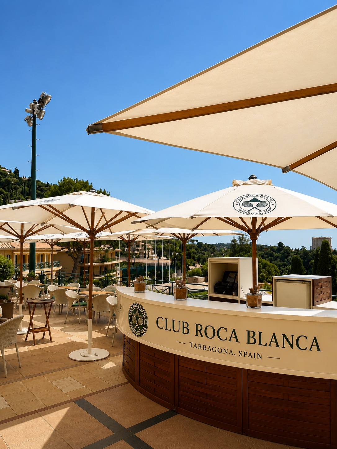
Roca Blanca came to us as a name and a piece of land. A clifftop plot on the Costa Daurada, pale limestone underfoot, the Mediterranean ahead. The brief was to build a brand identity worthy of both. We started where we always start — with what the place already was. The geology, the light, the silence of a site that hadn't been touched yet. Roca Blanca didn't need to borrow from tennis culture or European club tradition. It needed to be exactly where it stood. The identity we built is rooted in terrain. The mark abstracts the stacked limestone bluffs the courts are carved into. The palette pulls directly from the site itself — terracotta clay, limestone white, the particular blue of the Mediterranean at four in the afternoon. Nothing was chosen for trend. Everything was chosen for permanence. The tone of voice followed the same logic. Short sentences. Concrete nouns. The kind of language a place speaks when it doesn't need to explain itself. The result is a brand that could only exist here — on this coast, on this rock, in this particular quality of Spanish light.
Next project
AA Cheldu Company Limited
Make the next one
Like this direction?Let's shape yours.
Share what needs to move: the brand, the campaign, the launch, or the system holding everything together.
Read praise from clients